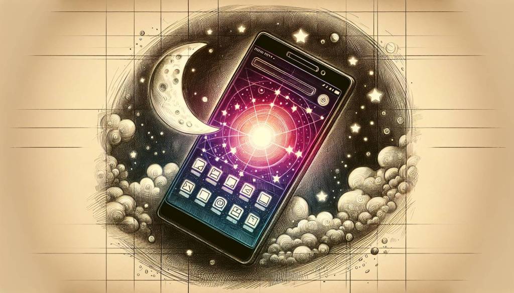
Google’s Search Labs has unveiled the Auto Dark Mode for websites through its iPhone application. Now, users can opt for dark mode all the time, regardless of the website, syncing all visited sites to the app’s dark theme. This upgrade enhances readability and conserves energy, particularly with OLED screens. Extra promising is its accessibility, linked directly to the device setting, permitting users to toggle this feature on or off at their discretion.
This feature comes as a default setting in the iPhone’s Google application, effectively transforming it into a browser with a separate tab system. With a few simple steps, users can switch off this function from the address bar, or reactivate it when desired, allowing users to tailor their browsing experience to their personal preference and comfort.
A new feature is a sun icon on the right side of the address bar, which lets users switch between dark and light modes.
Introducing Auto Dark Mode in Google’s iPhone application
Primarily using a gray color tone, its Auto Dark Mode promises customization, letting users adjust darkness parameters to match their comfort and display settings. Its intelligent functionality intuitively shifts between dark and light themes depending on environmental lighting conditions, with the option for manual switching available as well.
However, Google warns that dark mode conversion quality can vary between sites, and isn’t applicable to sites with custom dark themes of their own. Also, this feature isn’t functional with websites possessing pre-existing custom dark themes.
Exclusive currently for iPhone users only, the Auto Dark Mode feature can be activated by tapping the beaker icon at the top-left corner of the screen. As of now, it’s not available for Android users, but will be included in future updates. Google’s key goal here is to adapt system elements and applications to reduce strain on users’ eyes, based on the time of day. Until then, manual switching between light and dark modes is available through system settings.


